feeling over function
on good layering, in cities and in clothing
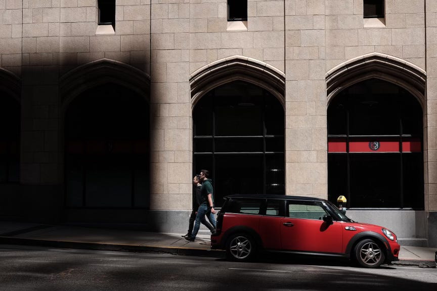
I took this picture a little while back, while walking around the financial district in San Francisco. I liked the notes of red (this was before a pop of red became *a thing*) and I liked the dramatic way the light bounced off the buildings, which you can catch sometimes on the rare sunny afternoon across the Bay. But it also captured something else: an entire block face of a building in which no one is welcome. Look at the people walking past: they’re staring straight ahead; their strides are determined. They’re not trying to linger. There is nowhere for them to linger.
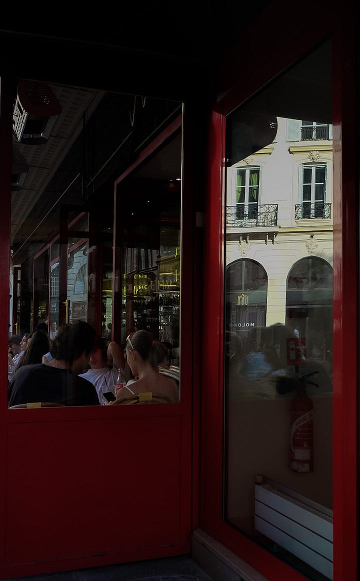
Contrast this to a cafe I walked past in Paris a couple years ago. Here, the boundary between building and public space is, quite literally, blurred. The window is open, and people sit contentedly in the middle ground. It invites people in—and invites people like me to pause and observe, and maybe even take a picture.
One of my favorite urbanism books is Soft City, by the designer and architect David Sim. It’s well worth a read, if you’re interested at all in urban design or our lived experiences in cities (you can also read the interview with him that I did a few years back). The book revolves around the idea of “softness” in how we create our cities. It’s a deliberately squishy term, meant to encapsulate a whole range of experiences—from the ease of shifting between public and private spaces, to the interconnectedness of transportation options, to the proximity of necessary amenities. Can you leave your front door and find what you need within a ten-minute walk, along with perhaps a sunny place to sit and people watch for a while, or read a book? Can you sit in a cafe and have a beer while watching your kid play in a park within eyeshot? These are soft city experiences—multidimensional, layered, fluid. If you’re following my thread, you know where I’m going with this: the facade in San Francisco is a rigid urban feature—single-purpose and unwelcoming—while the Paris cafe encapsulates softness.
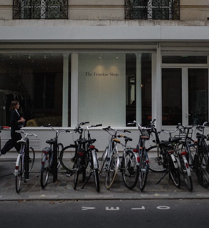
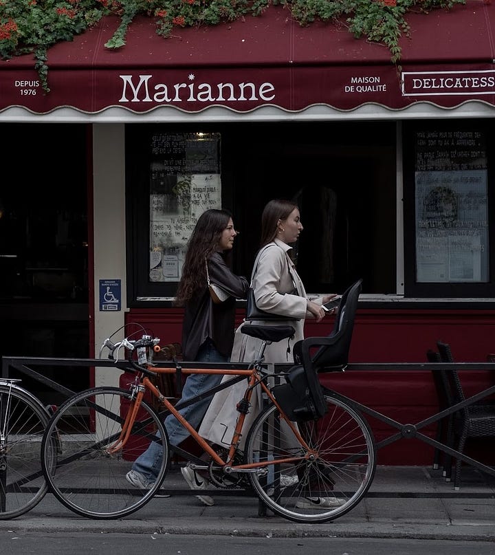
I’ve been thinking about this idea a lot this week, as I’ve been reading (yet another) book on urbanism, this one called The City at Eye Level. The concept at the heart of this book is quite intuitive: what we encounter at eye-level in a city most directly impacts our experience. What is at eye level? It’s ground-floor shops, walls, facades, seating, greenery, and other people. Think about your favorite street to walk down in a city: it probably nails the balance on all of these things. Most likely, it’s vibrant, diverse, filled with a pleasant mix of places and experiences, and enough people that you feel a part of something larger than yourself.
When streets fail to deliver a positive experience, it’s often an issue of scale. Humans like to absorb new details at a pace consistent with a leisurely stroll. You probably understand this intuitively: there is a reason why a 10-minute walk across a vast expanse of parking lot is excruciating, while a similar time spent exploring a beautiful street in Paris is filled with delight. In many more recently built cities, particularly those designed around the car like those in the US, human-scale is sacrificed for vehicle-scale. For someone in a car going 35, the beautiful details we take in at the speed of a walk become a blur. So many cities have capitulated to this, and lined their streets with large blocks of buildings that retain their significance at the speed of a car, but numb someone traveling on foot. It is the antithesis of softness.
Another key feature of the street is retailing - stores, windows with displays, signs to attract your attention, doorways, people going in and out of them. Big new office buildings have been eliminating stores. What they have been replacing them with is a frontage of plate glass through which you can behold bank officers sitting at desks. One of these stretches is dull enough. Block after block of them creates overpowering dullness.” – William Whyte, The Social Life of Small Urban Spaces
I wonder if softer and more inviting urban environments are more conducive to self-expression through style. If we encounter urban environments that are closed off, sterile, designed to keep us hurrying along, do we shape how we dress in response? People—including me! —like to romanticize places like Paris, Copenhagen, Seoul, London, and make broad claims that style is somehow inherent to these cities in ways that it is not in, say, Seattle or St. Louis. I don’t believe that style is inherent; I believe that it is learned, shaped, and endlessly evolving. But I do wonder if urban environments that offer proximity, fluidity and a diversity of experiences lead to greater consideration of style. If you’re constantly in contact with others—if the environment around you encourages you, every few steps, to pause, consider, notice new details and inputs—do you become more attuned to composition and presentation in other areas of your life? I think so. I like to notice, when I walk through a sensory-rich environment—like a street with a bunch of little shops and textures and people milling about—what jumps out to me. Maybe it’s the juxtaposition of colors that I’d never considered before, or the collective energy of a group of friends having a coffee, or a neon sign behind a display of dried flowers. There is so much to take in, and we are drawn, perhaps subconsciously, to contribute to it.


In his book Township, Gordon Cullen describes a multifaceted town in very similar language to how one might describe a well-composed outfit:
… we turn to an examination of the fabric of towns: colour, texture, scale, style, character, personality and uniqueness. Accepting the fact that most towns are of old foundation, their fabric will show evidence of differing periods in its architectural styles and also in the various accidents of layout. Many towns do so display this mixture of styles, materials and scales.
It’s something built over time; a layered and diverse expression that is specific to the place and invites curiosity and consideration. Conversely, a flat urban experience—endless, faceless, “functional” buildings and few other people in the street—doesn’t offer much in the way of a conversation to join.
Maybe, as The City at Eye Level suggests, we’ve over-indexed on functionality at the expense of “urban warmth”—the cultivation of an urban fabric that is decidedly geared toward social connection and human experience. Rather than thinking of cities as a collection of buildings and streets—functions and conduits—we should be thinking of how we create places that contain “personalities, destinations, activities, and connections between people.” In these places, style can become part of the connective tissue. It can exist in dialogue with the rich environment that surrounds it. A well-designed city welcomes and enriches personal style—and brings it out of the realm of the personal and into the public sphere.
It is not that we experience urban life from outside, but we are also part of it. People look at us, see us, talk to us, touch us, and smell us. It goes both ways. We are objects and subjects at the same time. We are connecting, interacting, sometimes strategically and sometimes without any conscious effort. – Thaddeus Muller


Curious to know why your picture taken in Paris feels soft to you. While, opened windows can be inviting, people appear to turn their back on us by design, perhaps even experiencing discomfort as backaches.
Also, I'd love to explore further your idea about the synchronicity between urban environments and styles. Do you happen to have any pictures from your trip to Paris that could help illustrate this?